Material design is a comprehensive guide for visual, motion, and interaction design across platforms and devices. Google announced Material Design on June 25, 2014, at the 2014 Google I/O conference. Material Design can be used in API Level 21 (Android 5.0) and newer via the v7 appcompat library, which is used on virtually all Android devices manufactured after 2009.
Material Design will gradually be extended throughout Google’s array of web and mobile products, providing a consistent experience across all platforms and applications. Google has also released application programming interfaces (APIs) for third-party developers to incorporate the design language into their applications.
Already I have created a post for the different material components in android. In this guide, I am putting all the posts together and it will be easy to learn android material components in one place.
Let’s see all the material components in detail with an example,
Android Chips
Chip is a component that can represent the input, filter, choice, or action of a user. This post will be on the implementation of different chip types and various attributes of chips.
A Material Chip represents a complex entity in a small block, such as a contact. It is a rounded button that consists of a label, an optional chip icon, and an optional close icon. A chip can either be clicked or toggled if it is checkable.
Types Of Material Chip
There are four types of chips:
- Entry (Input) Chips
- Filter Chips
- Choice Chips
- Action Chips
Chips are generally used with ChipGroup which is to hold a number of chips.
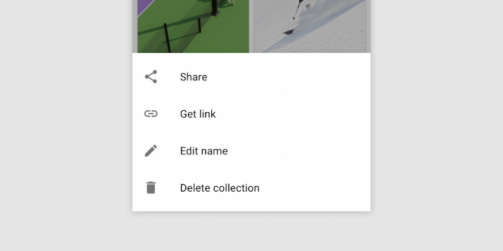
Material Menus
A menu displays a list of choices on a temporary surface. They appear when users interact with a button, action, or other control.

Types of menus
- Dropdown menus
- Exposed dropdown menus
Navigation Rail
The Navigation rail acts as a side navigation component or sidebar and can hold from three to seven destination views. Each view consists of an icon and a respective label, just as we know it from the Bottom view. In contrast to the Bottom view, it is aligned vertically and can also be used in combination with a NavigationDrawer.
Navigation rails should be used for
- Top-level destinations that need to be accessible anywhere in an app
- Three to seven main destinations in a product
- Tablet or desktop layouts
Navigation rails shouldn’t be used for:
- Small screen sizes
- Single tasks, such as viewing a single email
- Secondary navigation destinations
Navigation Drawer
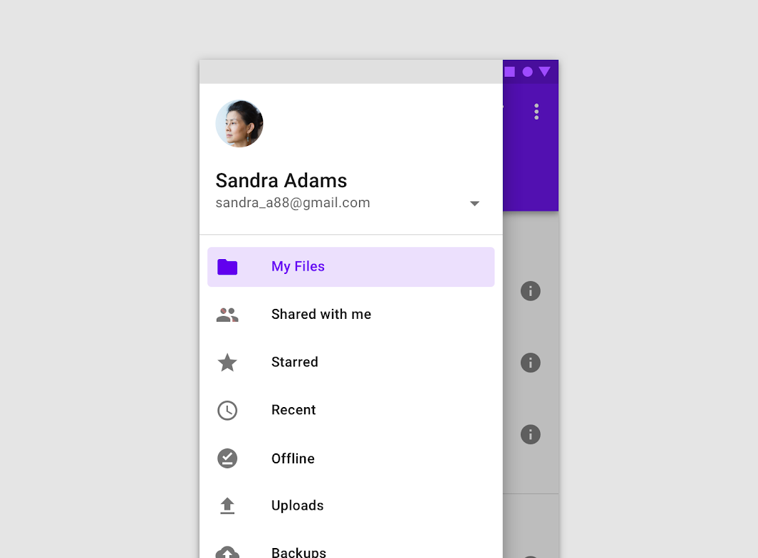
Navigation drawers provide access to destinations and app functionality, such as switching accounts. They can either be permanently on-screen or controlled by a navigation menu icon.
Navigation drawers are recommended for:
- Apps with five or more top-level destinations
- Apps with two or more levels of the navigation hierarchy
- Quick navigation between unrelated destinations
Snackbar
Snackbars inform users of a process that an app has performed or will perform. They appear temporarily, toward the bottom of the screen. They shouldn’t interrupt the user experience, and they don’t require user input to disappear.
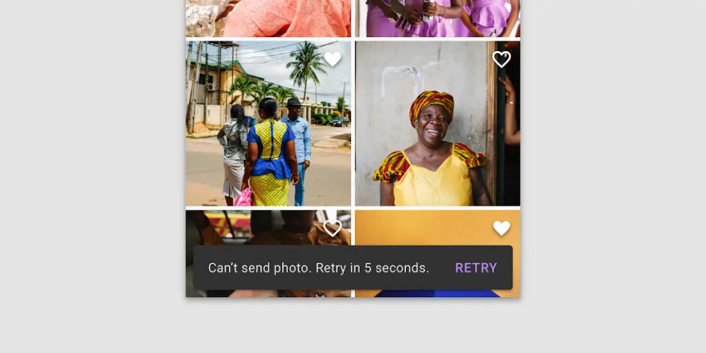
Frequency
Only one snackbar may be displayed at a time.
Actions
A snackbar can contain a single action. “Dismiss” or “cancel” actions are optional.
Bottom Sheets
Bottom Sheets are surface components that hold supplementary screen content. They are anchored to the bottom of a screen (making them ergonomic on mobile/tablet devices) and, similar to Dialogs, are elevated over main screen content. In most cases, they can be expanded/dismissed via a drag-up/down gesture.
From a design perspective, there are two types of Bottom Sheets:
- Standard Bottom Sheet: They operate independently to (and allow for simultaneous interaction with) primary screen content. They can be in an expanded, collapsed, or hidden state.
- Modal Bottom Sheet: They block primary screen content and must be interacted with or dismissed. A semi-transparent scrim, which can be tapped to dismiss, is displayed behind them to indicate the underlying UI is temporarily inaccessible.
Sliders
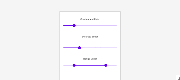
A Slider is a useful control for allowing the user to specify values without having to use the keyboard. The basic use case for it is very similar to the Android Framework SeekBar or the AppCompatSeekBar widgets.
Types of sliders
There are two types of sliders.
- Continuous Slider
- Discrete Slider
Also, We have another slider called the range slider.
ShapeableImageView
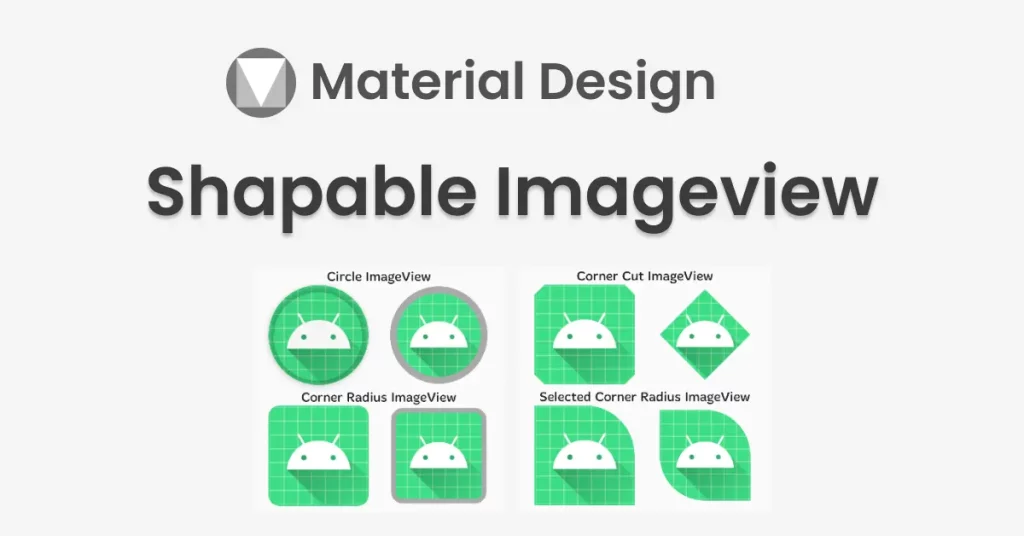
By using ShapeableImageView, you can change the shape of your image to a circle, diamond, etc. Also, you can set a corner radius to your image view.
The Material Components Library introduced with the 1.2.0-alpha03 the new ShapeableImageView.
Progress Indicators
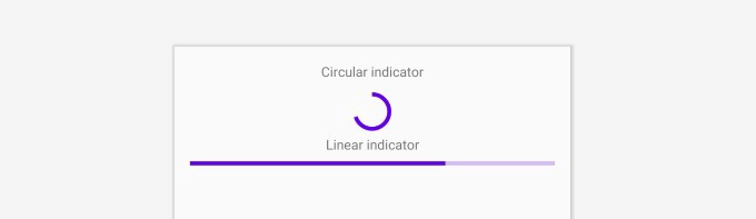
Progress indicators inform users about the status of ongoing processes, such as loading an app, submitting a form, or saving updates. They communicate an app’s state and indicate available actions, such as whether users can navigate away from the current screen.
Types
Material Design offers two visually distinct types of progress indicators:
- Linear
- Circular
Conclusion
Thanks for reading. Please provide your feedback on this guide.
Leave a Reply