
Jetpack Compose is Android’s modern toolkit for building native UI. It simplifies and accelerates UI development on Android. Quickly bring your app to life with less code, powerful tools, and intuitive Kotlin APIs.
To learn more about the jetpack compose internals, Please check the official documents. In this post, I am focusing on creating material components using jetpack compose.
Jetpack compose tutorial by android developers
If you’re new to Compose, I highly recommend going through the following articles:
Getting started with jetpack compose – Modifiers
Getting started with jetpack compose – Layouts
Getting started with jetpack compose – ConstraintLayout
Setup jetpack compose on android studio
Method 1 – Creating a new Jetpack compose Project
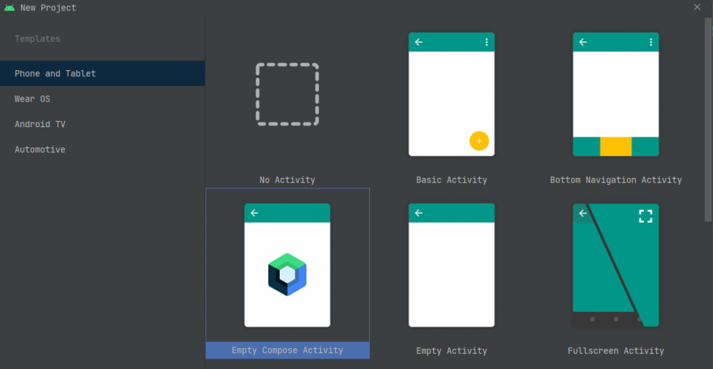
Create New Project by selecting Empty Compose Activity, It will add all the Gradle dependencies in the Gradle file and MainAcitivity to accept composable. So, straightaway we can start working on the project.
Method 2 – Migrate Existing Android Studio Project
Add jetpack compose version in the project build.gradle file.
buildscript {
        ext {
            compose_version = '1.0.0'
        }
        ...
    }
Then, add the build features and compose options in your module-level build.gradle file.
compileOptions {
            sourceCompatibility "1.8"
            targetCompatibility "1.8"
        }
        kotlinOptions {
            jvmTarget = '1.8'
            useIR = true
        }
        buildFeatures {
            compose true
        }
        composeOptions {
            kotlinCompilerExtensionVersion compose_version
            kotlinCompilerVersion '1.5.10'
        }
        packagingOptions {
            resources {
                excludes += '/META-INF/{AL2.0,LGPL2.1}'
            }
        }
The next step is to add the jetpack compose dependencies in the gradle file.
implementation "androidx.compose.ui:ui:$compose_version"
        implementation "androidx.compose.material:material:$compose_version"
        implementation "androidx.compose.ui:ui-tooling-preview:$compose_version"
        implementation 'androidx.activity:activity-compose:1.3.1'
        debugImplementation "androidx.compose.ui:ui-tooling:$compose_version"
Finally, change your MainAcitivity.kt to extend ComponentActivity. Also, add the setContent to accept the composable content on oncreate().
class MainActivity : ComponentActivity() {
        override fun onCreate(savedInstanceState: Bundle?) {
            super.onCreate(savedInstanceState)
            setContent {
            }
        }
    }
Ok. the setup Is completed. The next step is to create compose components.
Before getting started into jetpack components, you should know about the layouts, Modifiers, and mutablestate in kotlin compose. Please check the below links for your reference.
Jetpack compose components
Text
Text is a central piece of any UI, and Jetpack Compose makes it easier to display or write text.
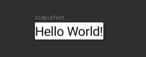
Displaying text
@Composable
    fun SimpleText() {
        Text(text = "Hello World!")
    }
Reading text from resource
@Composable
    fun SimpleText() {
        Text(text = stringResource(R.string.hello_world))
    }
Changing the text color
@Composable
    fun SimpleText() {
        Text(text = stringResource(R.string.hello_world), color = Color.Blue)
    }
Changing the font size / font weight / font Family / font style
Text(text = stringResource(R.string.hello_world), fontSize = 20.sp)
    Text(text = stringResource(R.string.hello_world), fontSize = 20.sp, fontWeight = FontWeight.Bold)
    Text(text = stringResource(R.string.hello_world), fontSize = 20.sp, fontWeight = FontWeight.Bold, fontStyle = FontStyle.Italic)
    Text(text = stringResource(R.string.hello_world), fontSize = 20.sp, fontWeight = FontWeight.Bold, fontStyle = FontStyle.Italic , fontFamily = FontFamily.Monospace)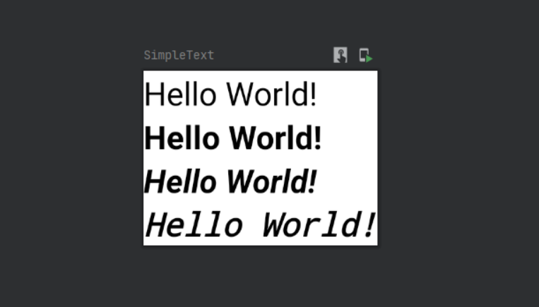
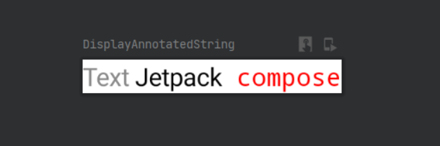
Multiple styles in a text
@Composable
    fun DisplayAnnotatedString() {
        val context = LocalContext.current
        Text(buildAnnotatedString {
            withStyle(style = SpanStyle(color = Color.Gray)) {
                append("Text")
            }
            append(" Jetpack")
            withStyle(style = SpanStyle(color = Color.Red, fontFamily = FontFamily.Monospace)) {
                append(" compose")
            }
        })
    }
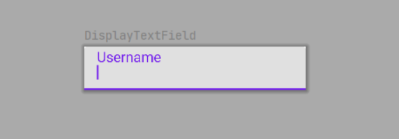
Text Field
TextField allows users to enter and modify text.
 @Composable
    fun DisplayTextField() {
        var name by remember {
            mutableStateOf("")
        }
        TextField(value = name, onValueChange = { it ->
            name = it
        }, label = { Text(text = "Username") })
    }
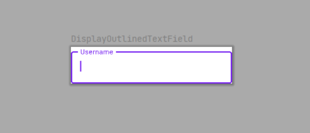
Outlined TextField
@Composable
    fun DisplayOutlinedTextField() {
        var name by remember {
            mutableStateOf("")
        }
        OutlinedTextField(value = name, onValueChange = { it ->
            name = it
        }, label = { Text(text = "Username") })
    }
Styling TextField
singleLinemaxLinestextStyle
@Composable
fun DisplayTextField() {
var name by remember {
mutableStateOf("")
}
TextField(value = name, onValueChange = { it ->
name = it
}, label = { Text(text = "Username", style = TextStyle(fontSize = 18.sp)) },
maxLines = 1, modifier = Modifier.padding(8.dp),
textStyle = TextStyle(color = Color.Red, fontFamily = FontFamily.Monospace))
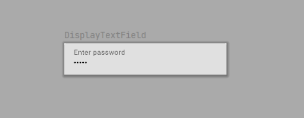
}Keyboard options
capitalizationautoCorrectkeyboardTypeimeAction
fun DisplayTextField() {
        var password by remember {
            mutableStateOf("Hello")
        }
        TextField(
            value = password,
            onValueChange = { password = it },
            label = { Text("Enter password") },
            visualTransformation = PasswordVisualTransformation(),
            keyboardOptions = KeyboardOptions(keyboardType = KeyboardType.Password)
        )
    }
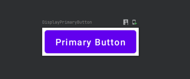
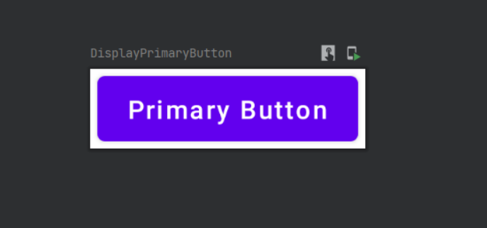
Button
A Button has an onClick-Function. You can add a Text-Composable or any other Composables as child elements of the Button.
@Composable
    fun DisplayPrimaryButton() {
        val context = LocalContext.current
        Button(onClick = {
            Toast.makeText(context, "Primary Button clicked", Toast.LENGTH_SHORT).show()
        }, Modifier.padding(4.dp)) {
            Text(
                text = "Primary Button")
        }
    }
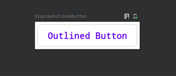
Outlined Button
@Composable
    fun DisplayOutlinedButton() {
        val context = LocalContext.current
        OutlinedButton(onClick = { Toast.makeText(context, "Outlined Button clicked",
            Toast.LENGTH_SHORT).show()
        }, Modifier.padding(4.dp)) {
            Text(
                text = "Outlined Button"
            )
        }
    }
Styling Button
@Composable
    fun DisplayPrimaryButton() {
        val context = LocalContext.current
        Button(onClick = {
            Toast.makeText(context, "Primary Button clicked", Toast.LENGTH_SHORT).show()
        }, Modifier.padding(4.dp)) {
            Text(
                text = "Primary Button",
                style = TextStyle(fontSize = 22.sp,fontFamily = FontFamily.Monospace, fontWeight = FontWeight.Bold)
            )
        }
    }
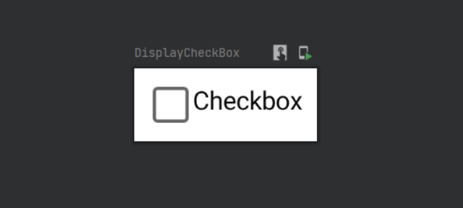
Checkbox
@Composable
    fun DisplayCheckBox() {
        var checkStatus by remember {
            mutableStateOf(false)
        }
        Row {
            Checkbox(checked = checkStatus, onCheckedChange = {
                checkStatus = it
            })
            Text(text = "Checkbox", Modifier.clickable { checkStatus = !checkStatus })
        }
    }
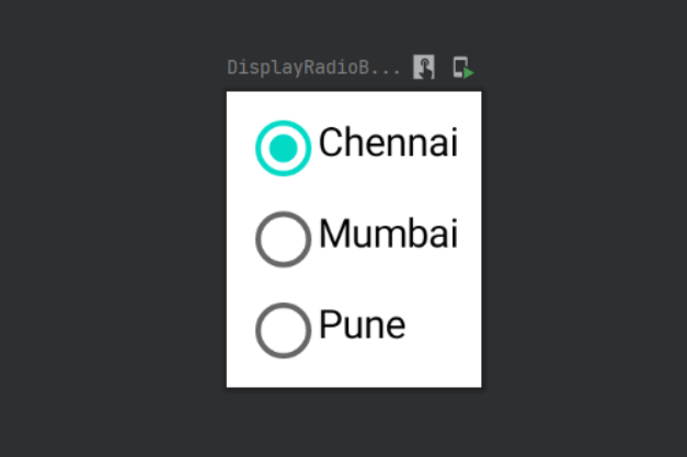
Radio Button
@Composable
    fun DisplayRadioButton() {
        val cities = listOf("Chennai", "Mumbai", "Pune")
        val (selected, onOptionSelected) = remember {
            mutableStateOf(cities[0])
        }
        Column(Modifier.padding(4.dp)) {
            cities.forEach { text ->
                Row(modifier = Modifier.padding(4.dp)) {
                    RadioButton(selected = selected == text, onClick = {
                        onOptionSelected(text)
                    })
                    Text(text = text, Modifier.clickable { onOptionSelected(text) })
                }
            }
        }
    }
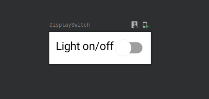
Switch
@Composable
    fun DisplaySwitch() {
        val context = LocalContext.current
        var switchStatus by remember {
            mutableStateOf(false)
        }
        Row(Modifier.padding(8.dp)) {
            Text(text = "Light on/off")
            Switch(checked = switchStatus, onCheckedChange = {
                switchStatus = it
                Toast.makeText(context, "Light ${if (it) "on" else "off"}", Toast.LENGTH_SHORT).show() })
        }
    }
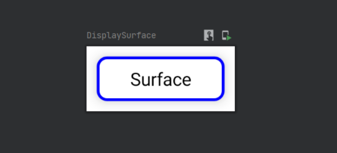
Surface
The surface is like a view in android. So can add background color, shape, elevation, border, etc.
@ExperimentalMaterialApi
    @Composable
    fun DisplaySurface() {
        val context = LocalContext.current
        Surface(shape = RoundedCornerShape(8.dp), elevation = 8.dp, onClick = {
            Toast.makeText(
                context,
                "Surface clicked",
                Toast.LENGTH_SHORT
            ).show()},border = BorderStroke(2.dp, Color.Blue), modifier = Modifier.padding(8.dp).width(100.dp)) {
            Text(text = "Surface",Modifier.padding(8.dp), textAlign = TextAlign.Center)
        }
    }
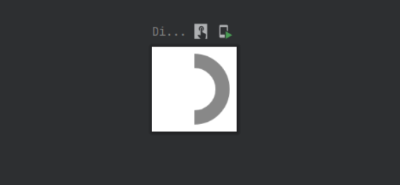
Circular Progress Indicator
A CircularProgressIndicator can be used to display progress in a circular shape.
Indeterminate
When you use the CircularProgressIndicator without the progress parameter, it will run forever.
@Composable
    fun DisplayCircularProgressBar() {
            CircularProgressIndicator(strokeWidth = 8.dp, color = Color.Gray, modifier = Modifier.padding(4.dp))
    }
Determinate
When you set a value to the progress parameter, the indicator will be shown with that progress.
@Composable
    fun DisplayCircularProgressBar() {
            CircularProgressIndicator(progress = 0.5f, strokeWidth = 8.dp, color = Color.Gray, modifier = Modifier.padding(4.dp))
    }
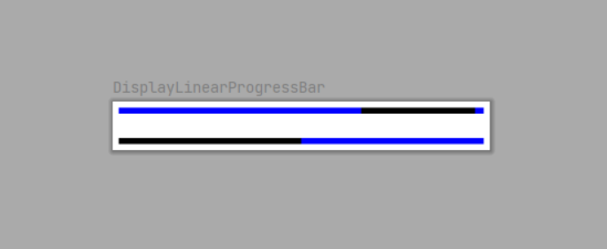
Linear Progress Indicator
A LinearProgressIndicator can be used to display progress in a linear line, also known as a progress bar.
Indeterminate
When you use the LinearProgressIndicator without the progress parameter.
 @Composable
    fun DisplayLinearProgressBar() {
        LinearProgressIndicator(backgroundColor = Color.Blue, color = Color.Black, modifier = Modifier.padding(4.dp))
    }
Determinate
When you set a value to the progress parameter, the indicator will be shown with that progress.
@Composable
    fun DisplayLinearProgressBar() {
        LinearProgressIndicator(progress = 0.5f, backgroundColor = Color.Blue, color = Color.Black, modifier = Modifier.padding(4.dp))
    }
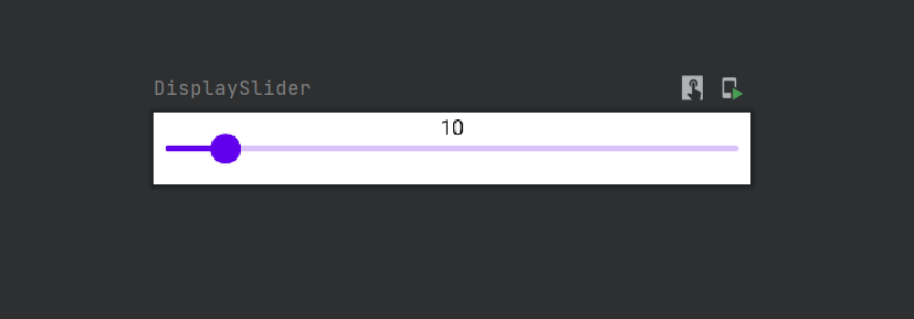
Slider
Sliders allow users to make selections from a range of values.
@Composable
    fun DisplaySlider() {
        Spacer(modifier = Modifier.padding(4.dp))
        var sliderValue by remember {
            mutableStateOf(10.0f)
        }
        Text(text = sliderValue.toInt().toString(), modifier = Modifier.fillMaxWidth(),textAlign = TextAlign.Center)
        Slider(value = sliderValue, onValueChange = {sliderValue = it}, valueRange = 0f..100f)
    }
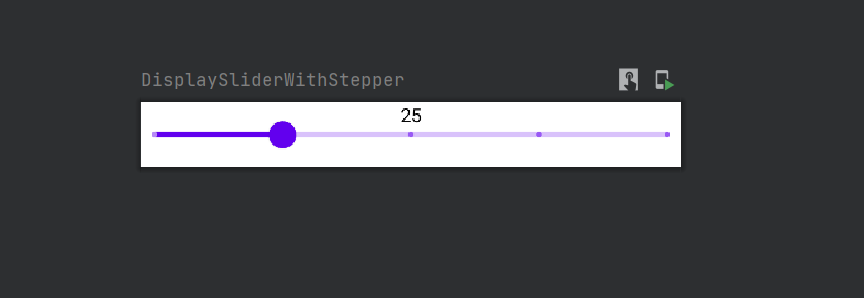
Slider with steps
@Composable
    fun DisplaySliderWithStepper() {
        var sliderValue by remember {
            mutableStateOf(25.0f)
        }
        Text(text = sliderValue.toInt().toString(), modifier = Modifier.fillMaxWidth(),textAlign = TextAlign.Center)
        Slider(value = sliderValue, onValueChange = {sliderValue = it}, steps = 3, valueRange = 0f..100f)
    }
Spacer
The spacer component is used to display an empty space. Width and (or) height can be set for Spacer using the Modifier object.
@Composable
    fun DisplaySpacer() {
        Spacer(modifier = Modifier
            .padding(8.dp)
            .height(40.dp)
            .fillMaxWidth()
            .background(Color.Gray))
    }
Thanks for reading. Also, you can download this example from GITHUB.
If you like this post, you can follow me on
Leave a Reply