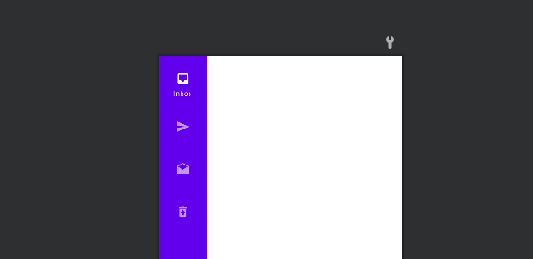
The rail is a side navigation component that displays three to seven app destinations and, optionally, a Floating Action Button. Each destination is represented by an icon and a text label.
The rail can function on its own at larger screen sizes, such as desktops and tablets. When users transition between screen sizes and devices, the rail can also complement other navigation components, such as bottom navigation.
Before getting into details, Checkout my other post on material design,
Sliders – Material Component For Android
ShapeableImageView – Material components for android [Example]
Progress Indicators – Material Components For Android
Android Chips – Material Component For Android
Navigation rails should be used for:
- Top-level destinations that need to be accessible anywhere in an app
- Three to seven main destinations in a product
- Tablet or desktop layouts
Navigation rails shouldn’t be used for
- Small screen sizes
- Single tasks, such as viewing a single email
- Secondary navigation destinations
Before we can get started, you need to add the dependency for the Android Material Components library. The Navigation Rail is only currently available in the latest release of1.4.0.
implementation 'com.google.android.material:material:1.4.0'Adding Navigation Rail in layout
Create a new layout file or just add the NavigationRailView to one of your existing layouts like in the following XML snippet.
<com.google.android.material.navigationrail.NavigationRailView
        android:id="@+id/navigation_rail"
        android:layout_width="wrap_content"
        android:layout_height="match_parent"
        app:menu="@menu/navigation_rail_menu"
        app:layout_constraintStart_toStartOf="parent"
        app:layout_constraintTop_toTopOf="parent"
        style="@style/Widget.MaterialComponents.NavigationRailView.Colored" />
When adding this view to your layout, there are some typical guidelines that should be followed. These most likely depend on what your view hierarchy consists of, but as a general guide:
- The Navigation Rail should sit below the TopBar of the current screen. This Rail should not overlap the top bar or be shown underneath this. Its height should fill the space between the bottom of the top app bar and the bottom of the screen
- The Navigation Rail should be shown at the side of the main content area of the current screen. It should not be shown on top of this content, instead, the content area should be shown next to the Navigation Rail.
Adding Menu
The parameter **app:menu** takes a menu reference and holds all the navigation views to be displayed in the NavigationRailas menu items.
<com.google.android.material.navigationrail.NavigationRailView
        android:id="@+id/navigation_rail"
        android:layout_width="wrap_content"
        android:layout_height="match_parent"
        app:menu="@menu/navigation_rail_menu" />
An example menu navigation_rail_menu.xml look like this:
<menu xmlns:android="http://schemas.android.com/apk/res/android">
        <item
            android:id="@+id/inbox"
            android:enabled="true"
            android:icon="@drawable/ic_baseline_inbox_24"
            android:title="Inbox"/>
        <item
            android:id="@+id/sent"
            android:enabled="true"
            android:icon="@drawable/ic_baseline_send_24"
            android:title="Sent"/>
        <item
            android:id="@+id/draft"
            android:enabled="true"
            android:icon="@drawable/ic_baseline_drafts_24"
            android:title="Draft"/>
        <item
            android:id="@+id/trash"
            android:enabled="true"
            android:icon="@drawable/ic_baseline_restore_from_trash_24"
            android:title="Trash"/>
    </menu>
Menu Gravity
Navigation rail destinations can be aligned as a group to the top, bottom, or center of a layout. On tablets, bottom alignment can make destinations easier for a user to reach with their thumbs.
app:menuGravity="top | center | bottom"

 <com.google.android.material.navigationrail.NavigationRailView
        android:id="@+id/navigation_rail"
        android:layout_width="wrap_content"
        android:layout_height="match_parent"
        app:menu="@menu/navigation_rail_menu"
        app:menuGravity="top" />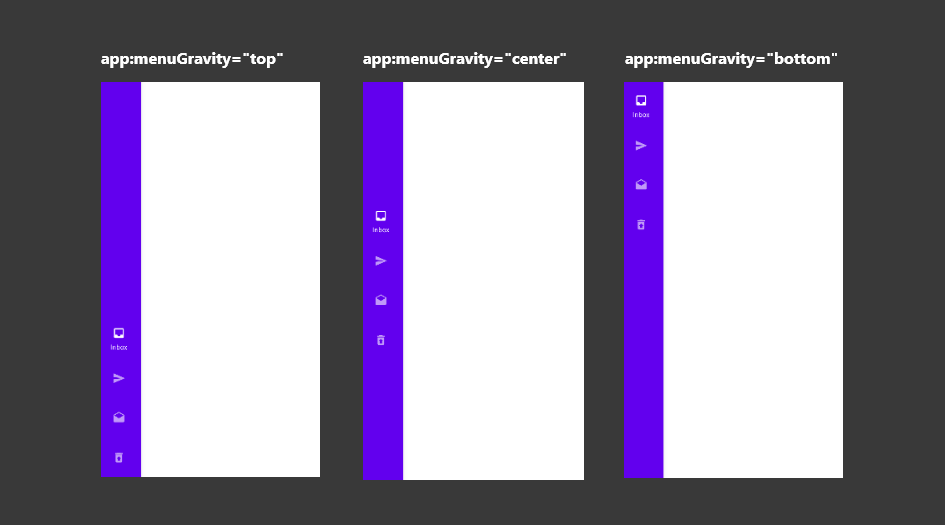
Menu Label Visibility
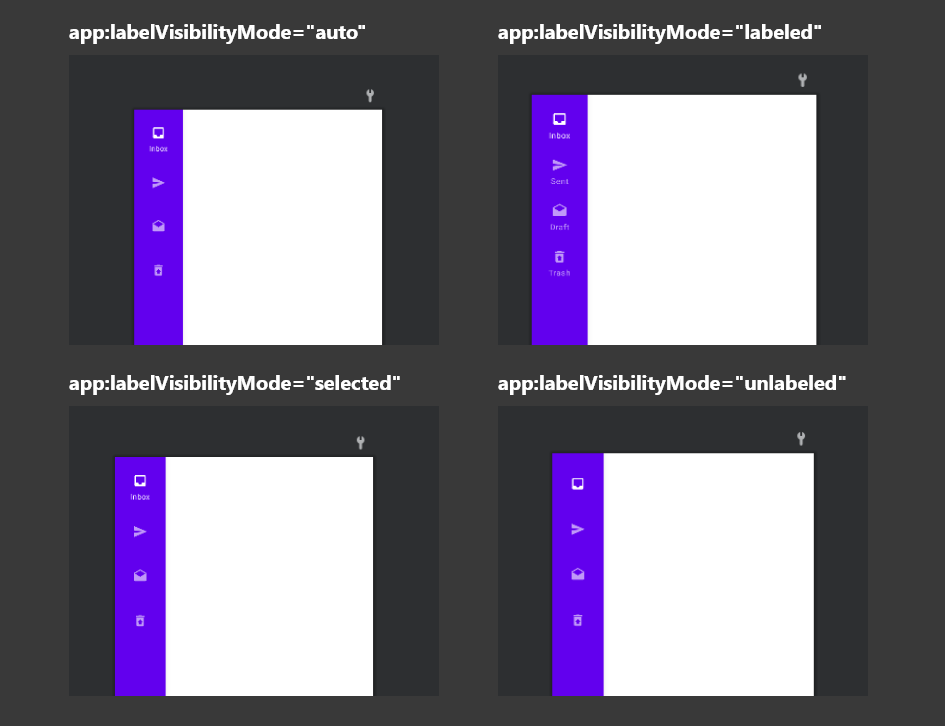
The label is only being shown for the currently selected item within the Rail. This is the default behavior for the label visibility and we can control this using the labelVisibilityMode attribute.
app:labelVisibilityMode="auto | labeled | selected | unlabeled"

    <com.google.android.material.navigationrail.NavigationRailView
        android:id="@+id/navigation_rail"
        android:layout_width="wrap_content"
        android:layout_height="match_parent"
        app:menu="@menu/navigation_rail_menu"
        app:labelVisibilityMode="auto"
        app:menuGravity="top"/>
auto – when there are more than 3 items the Rail will use the selected option, otherwise, the labeled option will be applied.
labeled – Persistent text labels are visible at all times, regardless of a destination’s state.
selected – Selected text labels appear only when a destination is activated.
unlabeled – If all icons in the navigation rail can be expected to have clear meaning to users, labels can be omitted as a group.
Adding Layout Header
The rail provides a convenient container for anchoring the Floating Action Button (FAB) to the top of a screen, placing the app’s key action above navigation destinations.
Other than showing a menu inside of our Navigation Rail, we can provide a layout reference for the headerLayout an attribute of the view.
app:headerLayout="@layout/layout_fab"
<com.google.android.material.navigationrail.NavigationRailView
        android:id="@+id/navigation_rail"
        android:layout_width="wrap_content"
        android:layout_height="match_parent"
        app:menu="@menu/navigation_rail_menu"
        app:headerLayout="@layout/layout_fab"
        app:labelVisibilityMode="labeled"
        app:menuGravity="top" />
layout_fab .xml
<?xml version="1.0" encoding="utf-8"?>
<LinearLayout xmlns:android="http://schemas.android.com/apk/res/android"
android:layout_width="wrap_content"
android:layout_height="wrap_content"
android:orientation="vertical">
<com.google.android.material.floatingactionbutton.FloatingActionButton
    android:id="@+id/fabMain"
    android:layout_width="wrap_content"
    android:layout_height="wrap_content"
    android:src="@android:drawable/ic_input_add" />
</LinearLayout>
Styling the Navigation Rail
There are several bundled styles that can be used to control how the Navigation Rail is displayed on the screen.
Default
With this default style applied, the different parts of the Navigation Rail have the following attributes applied to them:
- Rail Width:
72dp - Rail background:
colorSurface - Selected Icon color:
colorPrimary - Unselected Icon color:
colorOnSurface(at 60%)
style="@style/Widget.MaterialComponents.NavigationRailView"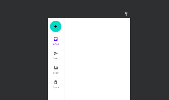
Colored
Similar to the PrimarySurface style.
- Rail Width:
72dp - Rail background:
colorPrimary - Selected Icon color:
colorOnPrimary - Unselected Icon color:
colorOnPrimary(at 60%)
style="@style/Widget.MaterialComponents.NavigationRailView.Colored"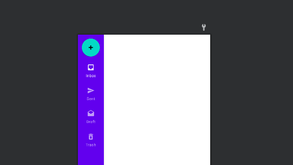
Compact
In some cases, we may want our Navigation Rail to take up less width in the screen. If the default width appears to take up more space than is needed, the following style can be used to use a reduced width:
- Rail Width:
52dp - Rail background:
colorSurface - Selected Icon color:
colorPrimary - Unselected Icon color:
colorOnSurface(at 60%)
style="@style/Widget.MaterialComponents.NavigationRailView.Compact"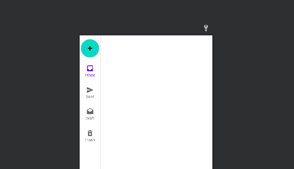
Colored.Compact
Similar to the PrimarySurface style that we previously covered, the **Colored.Compact** style uses the same attributes here with the small change of width:
- Rail Width:
52dp - Rail background:
colorPrimary - Selected Icon color:
colorOnPrimary - Unselected Icon color:
colorOnPrimary(at 60%)
style="@style/Widget.MaterialComponents.NavigationRailView.Colored.Compact"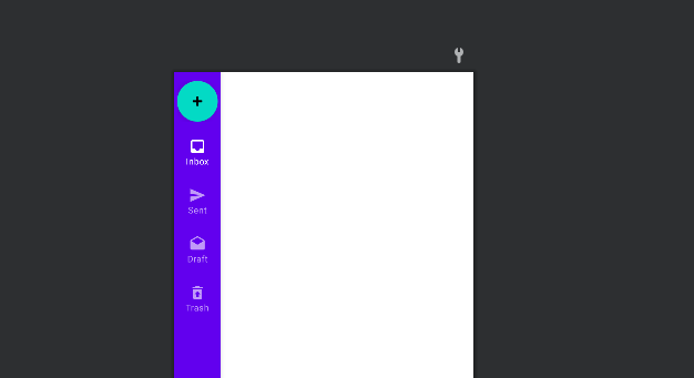
PrimarySurface
The Widget.MaterialComponents.NavigationRailView.PrimarySurface style will automatically switch between the component’s primary-colored style in a light theme and surface-colored style in a dark theme.
- Rail Width:
72dp - Rail background:
colorPrimary - Selected Icon color:
colorOnPrimary - Unselected Icon color:
colorOnPrimary(at 60%)
style="@style/Widget.MaterialComponents.NavigationRailView.PrimarySurface"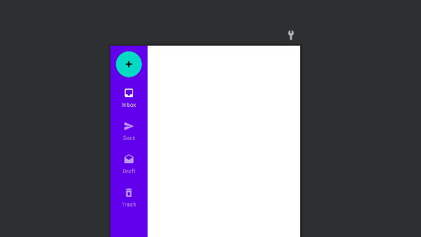
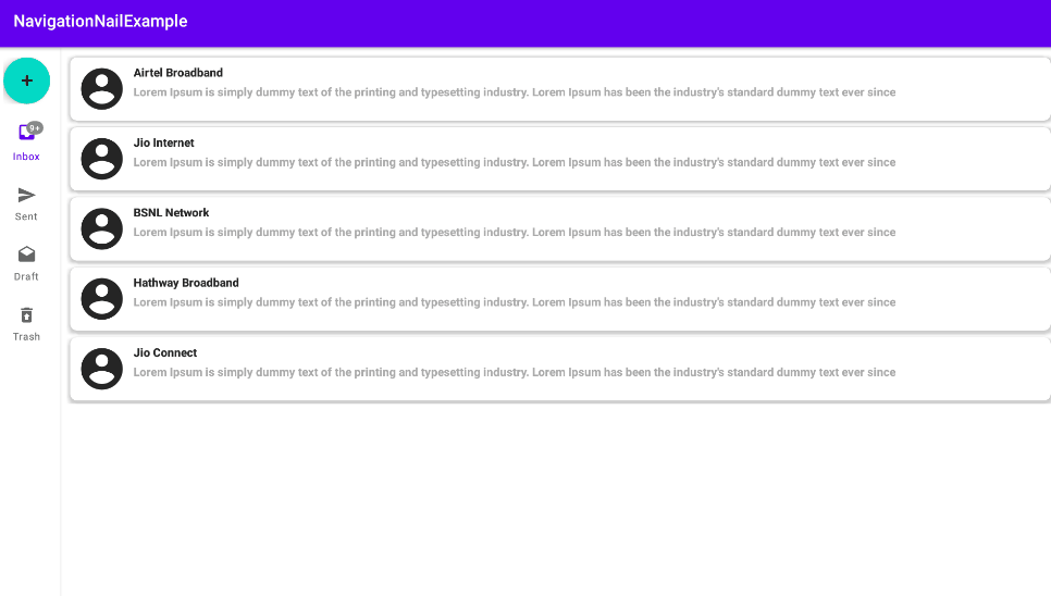
Displaying Badges
Rail icons can include badges in the upper right corner of the icon. Badges convey dynamic information about the associated destination, such as counts or status.
To apply for a badge we need to utilize the getOrCreateBadge function on our navigation rail.
val inboxBadge = mainBinding.navigationRail.getOrCreateBadge(R.id.inbox)Change the visibility of the badge using the visibility parameter.
inboxBadge.isVisible = trueSet the badge text using the number parameter.
inboxBadge.number = 10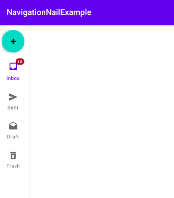
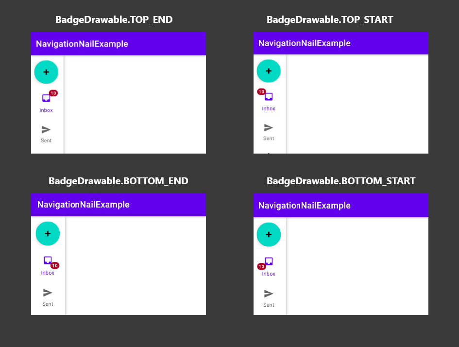
Badge Gravity
We can control the positioning of the badge using the badgeGravity an attribute of the BadgeDrawable.
inboxBadge.badgeGravity = BadgeDrawable.TOP_STARTWe can set the different badge gravity attributes.
- TOP_END
- TOP_START
- BOTTOM_END
- BOTTOM_START
Badge Color
We can set the colors for the badges individually, by using the backgroundColor and badgeTextColor on any of the BadgeDrawable references.
val inboxBadge = mainBinding.navigationRail.getOrCreateBadge(R.id.inbox)
    inboxBadge.isVisible = true
    inboxBadge.number = 10
    inboxBadge.badgeGravity = BadgeDrawable.TOP_END
    inboxBadge.backgroundColor = Color.GRAY
    inboxBadge.badgeTextColor = Color.WHITE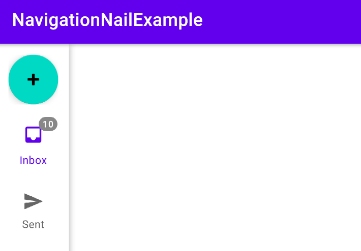
Badge Overflow
If we want to manually adjust the maximum number of characters that are to be displayed within a badge, we can do so using the maxCharacterCount attribute.
val inboxBadge = mainBinding.navigationRail.getOrCreateBadge(R.id.inbox)
    inboxBadge.isVisible = true
    inboxBadge.number = 56
    inboxBadge.maxCharacterCount = 2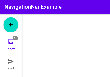
Badge Offset
The navigation badges are displayed outside of the icon area with enough space to not cause any overlapping. The verticalOffset and horizontalOffset attributes can be used to provide a pixel value offset for our navigation badge.
val inboxBadge = mainBinding.navigationRail.getOrCreateBadge(R.id.inbox)
    inboxBadge.isVisible = true
    inboxBadge.number = 56
    inboxBadge.badgeGravity = BadgeDrawable.TOP_END
    inboxBadge.backgroundColor = Color.GRAY
    inboxBadge.badgeTextColor = Color.WHITE
    inboxBadge.maxCharacterCount = 2
    inboxBadge.verticalOffset = 10
    inboxBadge.horizontalOffset = 10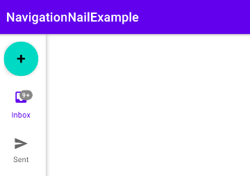
Handling Item Selected
we can set an item selection listener on our Navigation Rail and use this to react to any interactions with menu items – using the ID of the menu item to handle the corresponding menu item.
mainBinding.navigationRail.setOnItemSelectedListener { item ->
                        when (item.itemId) {
                            R.id.inbox -> {
                                // Respond to navigation item 1 click
                            }

                            R.id.sent -> {
                                true
                            }

                            R.id.draft -> {
                                true
                            }

                            R.id.trash -> {
                                true
                            }

                            else -> false
                        }
                    }
There’s also a method for detecting when navigation items have been reselected:
mainBinding.navigationRail.setOnNavigationItemReselectedListener { item ->
        when(item.itemId) {
            R.id.item1 -> {
                // Respond to navigation item 1 reselection
            }
            R.id.item2 -> {
                // Respond to navigation item 2 reselection
            }
        }
    }
That’s it. Thanks for reading.
You can download this example on Github.
Leave a Reply