In this tutorial, I will explain how we can create a tab layout using Jetpack Compose. TabLayout allows us to quickly navigate between related content on a single page, which appears toward the top of the screen.
TabLayout dependencies
Go to your app-level **gradle.build** file, and add the following:
implementation "com.google.accompanist:accompanist-pager:0.13.0"
    implementation "com.google.accompanist:accompanist-pager-indicators:0.13.0"
Once added the dependencies, let’s get into the coding part.
before getting started in to tab layout example, I created a tutorial for a better understanding of jetpack compose.
Getting started with jetpack compose – Layouts – Howtodoandroid
Getting started with jetpack compose – ConstraintLayout – Howtodoandroid
Jetpack Compose Archives – Howtodoandroid
Setup TabLayout
To set up the tab layout, in jetpack compose we need to create TabRow where can able to set all tab items and tab layout design.
@Composable
    fun TabRow(
        selectedTabIndex: Int,
        modifier: Modifier = Modifier,
        backgroundColor: Color = MaterialTheme.colors.primarySurface,
        contentColor: Color = contentColorFor(backgroundColor),
        indicator: @Composable (tabPositions: List<TabPosition>) -> Unit = @Composable { tabPositions ->
            TabRowDefaults.Indicator(
                Modifier.tabIndicatorOffset(tabPositions[selectedTabIndex])
            )
        },
        divider: @Composable () -> Unit = @Composable {
            TabRowDefaults.Divider()
        },
        tabs: @Composable () -> Unit
    )
important attributes of TabRow,
selectedTabIndex – The index of the currently selected tab.
backgroundColor – Background color of the tab layout.
contentColor – The tint color of the tab item text and icon.
indicator – Indicator for the currently selected tab.
divider – Display at the bottom of the Tab row.
tabs – The tab item to be displayed.
Let’s look into the Tab view and its attributes in the jetpack compose.
@Composable
    fun Tab(
        selected: Boolean,
        onClick: () -> Unit,
        modifier: Modifier = Modifier,
        enabled: Boolean = true,
        text: @Composable (() -> Unit)? = null,
        icon: @Composable (() -> Unit)? = null,
        interactionSource: MutableInteractionSource = remember { MutableInteractionSource() },
        selectedContentColor: Color = LocalContentColor.current,
        unselectedContentColor: Color = selectedContentColor.copy(alpha = ContentAlpha.medium)
    )
Tab view attributes,
selected – We need to set true/false to set the tab as selected or unselected.
onClick() – Accept the function that will be executed on click of the tab item.
modifier – The modifier to be applied to the tab.
enabled – Make the tab enabled/disabled. The default value is true and enabled.
text – The text of the tab.
icon – Set the Icon for the tab.
interactionSource – This can change how components appear in different states, such as the effect when a component is pressed.
selectedContentColor – Set the color for the tab content like text and icons when the tab is selected.
unselectedContentColor – Set the color for the tab content like text and icons when the tab is unselected.
below are some of the different types of tab layout designs.
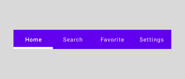
TabLayout with Text
We use only the text property to create a label in a tab. below, is the code for the tab layout with text implementation. Need to add only the text in the Tab item.
TabRow(
            selectedTabIndex = pagerState.currentPage,
            divider = {
                      Spacer(modifier =Modifier.height(5.dp))
            },
            indicator = { tabPositions ->
                TabRowDefaults.Indicator(
                    modifier = Modifier.pagerTabIndicatorOffset(pagerState, tabPositions),
                    height = 5.dp,
                    color = Color.White
                )
            },

            modifier = Modifier
                .fillMaxWidth()
                .wrapContentHeight()
        ) {
            tabData.forEachIndexed { index, s ->
                Tab(selected = pagerState.currentPage == index, onClick = {
                    scope.launch {
                        pagerState.animateScrollToPage(index)
                    }
                },
                    text = {
                        Text(text = s.first)
                    })
            }
        }
The design preview will be looks like this,
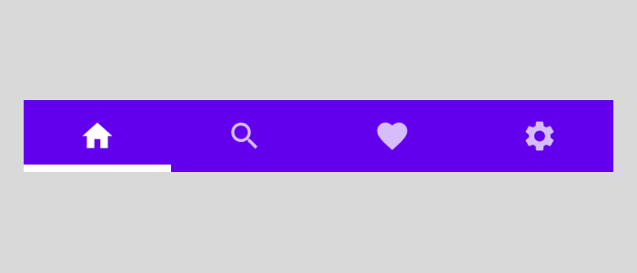
TabLayout with icon
We use only the icon property to create a label in a tab. Need to add only the icon in the Tab item.
TabRow(
            selectedTabIndex = pagerState.currentPage,
            divider = {
                      Spacer(modifier =Modifier.height(5.dp))
            },
            indicator = { tabPositions ->
                TabRowDefaults.Indicator(
                    modifier = Modifier.pagerTabIndicatorOffset(pagerState, tabPositions),
                    height = 5.dp,
                    color = Color.White
                )
            },

            modifier = Modifier
                .fillMaxWidth()
                .wrapContentHeight()
        ) {
            tabData.forEachIndexed { index, s ->
                Tab(selected = pagerState.currentPage == index, onClick = {
                    scope.launch {
                        pagerState.animateScrollToPage(index)
                    }
                },
                    icon = {
                        Icon(imageVector = s.second, contentDescription = null)
                    })
            }
        }
The design preview will be looks like this,
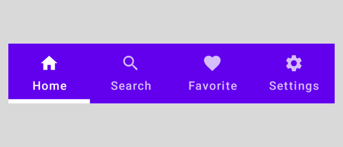
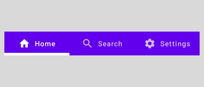
TabLayout with Text and Icon
We use both the text and icon properties to create a label in a tab.
TabRow(
            selectedTabIndex = pagerState.currentPage,
            divider = {
                      Spacer(modifier =Modifier.height(5.dp))
            },
            indicator = { tabPositions ->
                TabRowDefaults.Indicator(
                    modifier = Modifier.pagerTabIndicatorOffset(pagerState, tabPositions),
                    height = 5.dp,
                    color = Color.White
                )
            },
            modifier = Modifier
                .fillMaxWidth()
                .wrapContentHeight()
        ) {
            tabData.forEachIndexed { index, s ->
                Tab(selected = pagerState.currentPage == index, onClick = {
                    scope.launch {
                        pagerState.animateScrollToPage(index)
                    }
                },
                    icon = {
                        Icon(imageVector = s.second, contentDescription = null)
                    },
                    text = {
                        Text(text = s.first)
                    })
            }
        }
The preview of the above code,
Leading Icon TabLayout
For the leading icon, we need to use LeadingIconTab compostable. It’s better to use it for 3 or fewer items or with the tab layout with scroll enabled.
TabRow(
            selectedTabIndex = pagerState.currentPage,
            divider = {
                      Spacer(modifier =Modifier.height(5.dp))
            },
            indicator = { tabPositions ->
                TabRowDefaults.Indicator(
                    modifier = Modifier.pagerTabIndicatorOffset(pagerState, tabPositions),
                    height = 5.dp,
                    color = Color.White
                )
            },
            modifier = Modifier
                .fillMaxWidth()
                .wrapContentHeight()
        ) {
            tabData.forEachIndexed { index, s ->
                LeadingIconTab(selected = pagerState.currentPage == index, onClick = {
                    scope.launch {
                        pagerState.animateScrollToPage(index)
                    }
                },
                    icon = {
                        Icon(imageVector = s.second, contentDescription = null)
                    },
                    text = {
                        Text(text = s.first)
                    })
            }
        }
Scrollable TabLayout
To enable the scroll in the tab layout, we need to use ScrollableTabRow it as a root layout. The TabRow is now scrollable and doesn’t have fixed width. After that, we can add tab items as usual in the tab row.
ScrollableTabRow(
            selectedTabIndex = pagerState.currentPage,
            divider = {
                      Spacer(modifier =Modifier.height(5.dp))
            },
            indicator = { tabPositions ->
                TabRowDefaults.Indicator(
                    modifier = Modifier.pagerTabIndicatorOffset(pagerState, tabPositions),
                    height = 5.dp,
                    color = Color.White
                )
            },

            modifier = Modifier
                .fillMaxWidth()
                .wrapContentHeight()
        ) {
            tabData.forEachIndexed { index, s ->
                LeadingIconTab(selected = pagerState.currentPage == index, onClick = {
                    scope.launch {
                        pagerState.animateScrollToPage(index)
                    }
                },
                    icon = {
                        Icon(imageVector = s.second, contentDescription = null)
                    },
                    text = {
                        Text(text = s.first)
                    })
            }
        }
Setup ViewPager
We have a HorizontalPager that takes the state of the pager and the size of the tabs, and we’re displaying the View (or Screen) of the tab that is selected.
@ExperimentalPagerApi
    @Composable
    fun HorizontalPager(
        state: PagerState,
        modifier: Modifier = Modifier,
        reverseLayout: Boolean = false,
        itemSpacing: Dp = 0.dp,
        dragEnabled: Boolean = true,
        flingBehavior: FlingBehavior = PagerDefaults.defaultPagerFlingConfig(state),
        verticalAlignment: Alignment.Vertical = Alignment.CenterVertically,
        horizontalAlignment: Alignment.Horizontal = Alignment.CenterHorizontally,
        content: @Composable PagerScope.(page: Int) -> Unit,
    )
Using the HorizontalPager, we can update the screen based on the tab layout selection. PagerState maintains all the page-related data like the currently selected index and more. So based on the selected index we can change the current screen UI.
@OptIn(ExperimentalPagerApi::class)
    @Composable
    fun TabContent(pagerState: PagerState) {
        HorizontalPager(state = pagerState) { index ->
            when (index) {
                0 -> {
                    HomeScreen()
                }

                1 -> {
                    SearchScreen()
                }

                2 -> {
                    FavoritesScreen()
                }

                3 -> {
                    SettingsScreen()
                }
            }

        }
    }
That’s the end of the coding part. Please check and try this in your code and let me know your feedback. Also, I have uploaded the example code in GitHub. you can check this for your reference.
Leave a Reply