In this tutorial, I am going to explain how to create a dialog in jetpack compose android in very simple steps. In this example, I have created multiple alert dialogs with different use cases.
let’s get started with creating a simple alert dialog creation.
To learn more about the jetpack compose check out my other tutorials on jetpack compose.
Getting started with jetpack compose – Basic components
Getting started with jetpack compose – Layouts
Getting started with jetpack compose – ConstraintLayout
Creating dialog in Jetpack compose
To create a custom dialog we need to use Dialog() composable.
@Composable
    fun Dialog(
        onDismissRequest: () -> Unit,
        properties: DialogProperties = DialogProperties(),
        content: @Composable () -> Unit
    )
The Dialog composable will accept three parameters.
onDismissRequest() – will be called when the dialog is dismissed. For example when we are clicking outside of the dialog.
DialogProperties
@Immutable
    class DialogProperties @ExperimentalComposeUiApi constructor(
        val dismissOnBackPress: Boolean = true,
        val dismissOnClickOutside: Boolean = true,
        val securePolicy: SecureFlagPolicy = SecureFlagPolicy.Inherit,
        @Suppress("EXPERIMENTAL_ANNOTATION_ON_WRONG_TARGET")
        @get:ExperimentalComposeUiApi
        val usePlatformDefaultWidth: Boolean = true
    )
Dialog Properties are used to customize the behavior of a Dialog.
dismissOnBackPress: Boolean – whether the dialog can be dismissed by pressing the back button.
dismissOnClickOutside: Boolean – whether the dialog can be dismissed by clicking outside the dialog’s bounds.
securePolicy – Policy for setting WindowManager.LayoutParams.FLAG_SECURE on the dialog window.
usePlatformDefaultWidth – Whether the width of the dialog’s content should be limited to the platform default, which is smaller than the screen width.
Jetpack composes custom dialog example
below, I am going to show three different custom alert dialog examples,
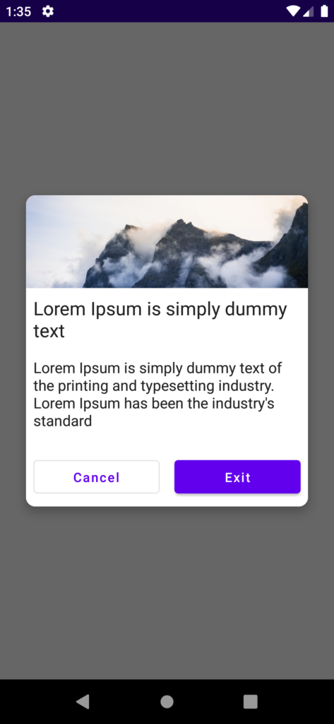
Custom dialog with Image
To create a custom dialog like this.
- First, create Dialog composable and set dismissRequest and dialog properties.
- Inside the dialog create your own view.
- finally, set up the dismiss dialog on the desired button.
@Composable
  fun CustomAlertDialog(onDismiss: () -> Unit, onExit: () -> Unit) {

        Dialog(onDismissRequest = { onDismiss() }, properties = DialogProperties(
            dismissOnBackPress = false,dismissOnClickOutside = false
        )) {
            Card(
                //shape = MaterialTheme.shapes.medium,
                shape = RoundedCornerShape(10.dp),
                // modifier = modifier.size(280.dp, 240.dp)
                modifier = Modifier
                    .fillMaxWidth()
                    .padding(8.dp),
                elevation = 8.dp
            ) {
                Column(
                    Modifier
                        .fillMaxWidth()
                        .background(Color.White)
                ) {

                    Row(
                        modifier = Modifier
                            .fillMaxWidth()
                            .height(100.dp)
                            .background(Color.Red.copy(alpha = 0.8F)),
                        verticalAlignment = Alignment.CenterVertically,
                        horizontalArrangement = Arrangement.Center,

                        ) {

                        Image(
                            painter = painterResource(id = R.drawable.background_image),
                            contentDescription = "Exit app",
                            modifier = Modifier.fillMaxSize(),
                            contentScale = ContentScale.FillWidth
                        )
                    }

                    Text(
                        text = "Lorem Ipsum is simply dummy text",
                        modifier = Modifier.padding(8.dp), fontSize = 20.sp
                    )

                    Text(
                        text = "Lorem Ipsum is simply dummy text of the printing and typesetting industry. Lorem Ipsum has been the industry's standard",
                        modifier = Modifier.padding(8.dp)
                    )

                    Row(Modifier.padding(top = 10.dp)) {
                        OutlinedButton(
                            onClick = { onDismiss() },
                            Modifier
                                .fillMaxWidth()
                                .padding(8.dp)
                                .weight(1F)
                        ) {
                            Text(text = "Cancel")
                        }

                        Button(
                            onClick = { onExit() },
                            Modifier
                                .fillMaxWidth()
                                .padding(8.dp)
                                .weight(1F)
                        ) {
                            Text(text = "Exit")
                        }
                    }

                }
            }
        }
  }
Now we have created the Custom dialog, to show the dialog on button click, you need to create a mutableStateOf() variable to maintain the dialog show and dismiss state.
Also, create conditions like if the variable is true call the dialog, otherwise don’t call the dialog function.
@Composable
    fun Content() {
        val context = LocalContext.current
        var showCustomDialog by remember {
            mutableStateOf(false)
        }

        Column(
            Modifier.fillMaxSize(),
            Arrangement.Center,
            horizontalAlignment = Alignment.CenterHorizontally
        ) {
            Button(onClick = { showCustomDialog = !showCustomDialog }, Modifier.wrapContentSize()) {
                Text(text = "Show Alert Dialog")
            }

        }

        if (showCustomDialog) {
            CustomAlertDialog({
                showCustomDialog = !showCustomDialog
            }, {
                val activity = (context as? Activity)
                activity?.finish()
            })
        }

    }
when clicking on the dismiss button on the dialog, need to update a variable to false to hide the dialog.
The final output of the code is below,
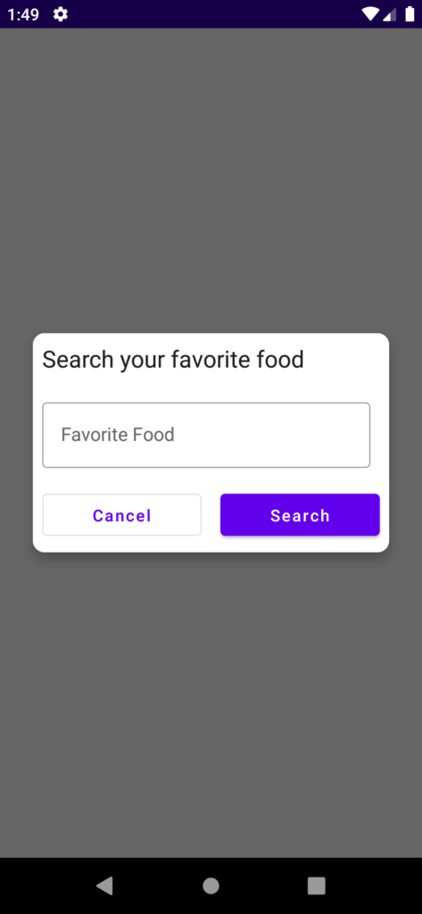
Alert dialog with Input field
As mentioned above, we need to create the dialog with a Dialog() composable function. But for the input field, we need to create a mutableStateOf() variable to hold the values of the input field.
@Composable
    fun InputDialogView(onDismiss:() -> Unit) {
        val context = LocalContext.current
        var searchedFood by remember {
            mutableStateOf("")
        }

        Dialog(onDismissRequest = { onDismiss() }) {
            Card(
                //shape = MaterialTheme.shapes.medium,
                shape = RoundedCornerShape(10.dp),
                // modifier = modifier.size(280.dp, 240.dp)
                modifier = Modifier.padding(8.dp),
                elevation = 8.dp
            ) {
                Column(
                    Modifier
                        .background(Color.White)
                ) {

                    Text(
                        text = "Search your favorite food",
                        modifier = Modifier.padding(8.dp),
                        fontSize = 20.sp
                    )

                    OutlinedTextField(
                        value = searchedFood,
                        onValueChange = { searchedFood = it }, modifier = Modifier.padding(8.dp),
                        label = { Text("Favorite Food") }
                    )

                    Row {
                        OutlinedButton(
                            onClick = { onDismiss() },
                            Modifier
                                .fillMaxWidth()
                                .padding(8.dp)
                                .weight(1F)
                        ) {
                            Text(text = "Cancel")
                        }

                        Button(
                            onClick = {
                                Toast.makeText(context, searchedFood, Toast.LENGTH_SHORT).show()
                                onDismiss() },
                            Modifier
                                .fillMaxWidth()
                                .padding(8.dp)
                                .weight(1F)
                        ) {
                            Text(text = "Search")
                        }
                    }

                }
            }
        }
    }
To display the dialog you need to follow the same way above. by creating the mutableStateOf() variable and making it true or false.
The output of the above code is,
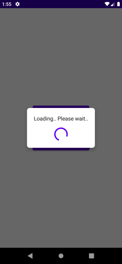
Loading Dialog
For the loading dialog, we need to use CircularProgressIndicator() composable function for loading animation. Apart from that everything is the same as other custom dialogs.
@Composable
    fun LoadingView(onDismiss:() -> Unit) {
        Dialog(onDismissRequest = { onDismiss() }) {

            Card(
                shape = RoundedCornerShape(8.dp),
                modifier = Modifier,
                elevation = 8.dp
            ) {
                Column(
                    Modifier
                        .background(Color.White)
                        .padding(12.dp)
                ) {
                    Text(
                        text = "Loading.. Please wait..",
                        Modifier
                            .padding(8.dp), textAlign = TextAlign.Center
                    )

                    CircularProgressIndicator(
                        strokeWidth = 4.dp,
                        modifier = Modifier
                            .align(Alignment.CenterHorizontally)
                            .padding(8.dp)
                    )
                }
            }
        }
    }
The output of the about loading dialog code,
That’s it. Thanks for reading. you can download this example on GitHub.
Leave a Reply